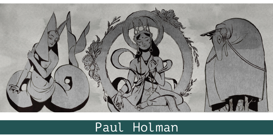
The Tarot of the Holy Light, currently available in an edition of some twelve hundred copies, is a deck designed and published by Christine Payne-Towler and her partner Michael Dowers. She has written extensively on what she terms the “continental tarot”—that is, decks in the tradition of Etteilla, Levi, Papus and Wirth—while he is an underground comic artist, editor and publisher.
Stylistically, it pulls together two tendencies which have become increasingly prominent in tarots issued over the last decade or so: it is both a collage deck, as exemplified by the psychogeographical tarots of Paris and Prague—not to mention any number of mash-ups of non-copyright art—and one which draws upon imagery from the great era of alchemical publications, which puts it in the company of Robert Place’s Alchemical Tarot, the Alchemical Emblem Tarot of F. J. Campos and Adam McLean, and Le Tarot des Alchimistes of Jean Beauchard.
It is tempting to view such decks as evidence of a growing tendency for alchemical iconography to be perceived as a natural visual language for the tarot, as was once the case with the imagery of ancient Egypt. This goes beyond the recognition of both alchemical illustration and the tarot drawing upon a common emblematic stock, just as the various attempts to present the Book of Thoth in its original dress were far more literal minded than a mere acknowledgement that the visual language it employed had sprung from Horapollo.
What is perhaps most interesting about this identification of alchemical imagery with the tarot is the evident lack of consensus on quite how these two systems, the interpretation of each of which is contested, should be mapped onto one another. A quick scan of the four decks I have mentioned reveals some interesting overlaps and disparities: the mermaid which one cannot but think of as the Starbucks logo, and which Place indeed identifies with the Star, is the Queen of Cups for Payne-Towler; her Empress is Diana of Ephesus, who also represents Isis (the Papess) in Beauchard’s deck, and Strength in Campos and McLean’s; Jupiter stands in as Payne-Towler’s King of Swords and Beauchard’s Adam (Emperor); while his Priesthood (Pope) is her Hermit: this last is the familiar image of Hermes Trismegistus bearing an armillary sphere.
While Place and Beauchard redraw and rework figures and details from alchemical illustrations, and Campos and McLean recontextualise the original designs through their placement in the deck, Payne-Towler and Dowers create collages that retain both the beauty and occassional stiffness of their source material, and make no attempt to smooth over the differences in style in their constituent parts. The resulting work is both highly referential and sensuous and, most appropriately, demands to be read as much as looked at. It is also very intensely coloured: the Tarot Balbi (which falls in the lineage invoked by Payne-Towler) is the only deck I can think of that delivers such a zing to the eye.
The outstanding collage works of the twentieth century were the product of a culture in which some works on paper were zealously preserved and others considered ephemeral: the process of collage subverted the cherished originality of the first, and raised the status of the second to art. This distinction has ceased to apply now that collage has become the manipulation of digitised images: there can be no difference of value between one image file and another, although the ongoing corporate and governmental attempts to enclose digital information raise the possibility of the emergence of a value system based upon daring and the difficulty of access.
It would be possible to playfully construct an argument that the alchemical books which this deck draws upon were themselves located in a kind of remix culture, rather than one based upon a concept of originality: leaving aside the many images which necessarily recur in slightly differing forms from book to book, many of the engravings from Maier’s Atalanta fugiens and Symbola aureae mensae, and Mylius’ Philosophia reformata—works which have a significant presence here—were resequenced to accompany fresh texts in the Viridarium chymicum of Daniel Stolcius.
Perhaps a good way to give some impression of the deck would be to draw a trump at random. This exercise gives me Strength, marked with its standard Marseille number, 11 (unusually in Arabic rather than Roman numerals) and the astrological sign of Mars. Instead of a mild-looking young woman subduing an unmistakably savage lion, we have the wreathed lion (here a normal tawny specimen, rather than one “green of pelt”) from Emblem 37 of Atalanta fugiens, standing solidly in front of the figure which Stanislas Klossowski de Rola identifies as Lady Alchimia, the embodiment of the Volatile Principle, from the frontispiece of Morley and Muykens’ Collectanea chymica Leidensia. The background of the card is largely derived from Atalanta fugiens, with the “fetid water” of the original transformed into fresh blue pools and some variety added to the landscape in the form of an outcrop of rock, a church and an extra tree or two.
There is no interaction between the two figures, which both face towards the reader. The lion is a herald, or a protector. In this version of the card the woman is, to an eye that does not interrogate the image for symbolism, frankly monstrous, which is not to deny her beauty: the lion, on the other hand, seems to possess both nobility and intelligence.
This leads me to wonder quite how our interpretation of these cards should be informed by their models: do a woman and a lion automatically constitute a Strength card, to be read in the same way as it would be in a Marseille deck, or indeed the Rider-Waite-Smith, or is the defining factor the relationship between them: the subjugation of the strong by the apparently weak? Crowley and Harris’s Lust card, showing the Scarlet Woman upon the Beast, is unmistakably a traditional Strength card, for all its Thelemic ramifications (one of the reasons why the Thoth is such an extraordinarily good deck is that, for all its intellectual and magical freight, it is built upon a solid appreciation of the traditional tarot). Interestingly, Place uses an image, which I assume to be derived from the Eleventh Key of Basil Valentine, that evokes both the Marseille card and the Thoth.
So what does the reader actually see when turning over such a card? And what is s/he intended to see? The traditional image, the reinterpretation, or some synthesis of the two? If The Tarot of the Holy Light was designed as an art deck (and it makes a fine one), there would be no issue about its making a shorthand reference to the established form of the card through the transformation of its two dominant figures. If, on the other hand, it is an esoteric tarot, which clearly seems to be the creators’ intention, it needs either to transmit the existing message of the card, which cannot be separated from the action portrayed upon it, or to signal that it has deliberately overwritten it.
Curiously, Klossowski finds an inherent connection between the figure from Collectanea chymica and the Strength card. In the unmodified form of the design, a chameleon perches upon the lady’s right hand: this has been obliterated by Payne-Towler and Dowers. Klossowski quotes Fulcanelli’s Les Demeures Philosophales: “The Mercury of the Philosophers … is nicknamed chamaileon—Chameleon or Crawling Lion [lion rampant], because he successively dons all the colours of the spectrum.” With this in mind, perhaps the entire meaning of the card might have been contained in a single punning image.
The minors are always problematic, as different people have different expectations of them. I personally tend to dislike fully illustrated minors, as I feel that they diminish the force of the majors: a problem that can be seen in the artwork for the forthcoming Mary-el Tarot, in which the quite magnificent minors leave the trumps looking rather wan and undistinguished. In The Tarot of the Holy Light, the minors are indeed pictorial, but are carefully differentiated from the majors: in general, I find their effect reminiscent of the decorated minors of a minchiate deck, or the symbolic designs of Eudes Picard, although they are far more lavish in detail than either.
A few of them are modelled upon the altogether too familiar Rider-Waite-Smith pattern: the most interesting of these is the 4 of Swords, in which the effigy of a knight reclining upon his tomb beneath three suspended swords has been replaced by the crowned double-headed hermaphrodite from Philosophia reformata: the structure of the image is the same, but its implications have shifted. The User’s Manual (little white book) which comes with the deck gives meanings of “meditation, retreat, repose, reconsideration” which seem to be a far closer fit to the card Payne-Towler and Dowers have taken for their model than the one they have actually produced, where the central image has unmistakably become one of rebirth.
In contrast to the largely unpeopled minors, the court cards necessarily focus upon human figures: a degree of consistency is imposed upon the pages and the knights by each set being drawn from a single source—the four pages are all from Goossen van Vreeswijk’s De goude leeuw, and the knights from the title page of the Musaeum hermeticum.
As all the reviews of this deck which I have encountered, by Adam McLean himself, Bonnie Cehovet and the notable tarot bloggers LeFanu and Mr. La-Luna, have quite rightly been full of praise for it, I feel that I might permit myself to point out a couple of issues which, who knows, might even be smoothed away in future printings if somebody raised them now.
The first point, which more or less everyone who has set eyes upon this deck has picked up on, is the mismatch between the box art, executed by the artist’s brother, and the cards themselves. While this doesn’t matter when the deck is being sold online, with sample images to refer to, it could prove to be a source of confusion as the deck moves further out into the world, as the box and cards really seem to belong to different decks. While there is no issue about the quality of Patrick Dowers’ artwork, I must say that I personally would pass on a deck that sent out those particular signals.
My second point, which bothers me far more, relates to the manner in which the cards are titled. This is done in an italic font, which strikes me as being too ornate for the purpose: I wouldn’t, however, bother picking up on this if it occurred consistently as it does in the minors, where it is printed in the white lower margin of the cards—after all, tarot forums are full of the boasts of people possessed of nail scissors and strong nerves who took a dislike to the borders of their cards—but the titles and elemental, planetary and zodiacal attributions of the majors are printed directly, left-justified, over the images themselves. I can’t believe that it is ever a good idea to superimpose lettering onto a design that is intended for contemplation, especially when the artwork is as dense as it is here, and I think its appearance makes the viewer far more conscious of the photoshopped nature of the images than would be the case otherwise. The different proportion of the images for the majors and minors makes me wonder if the majors were originally intended to be printed without text: whatever, I really hope that any republication of The Tarot of the Holy Light will do away with this intrusive lettering, as it is the one thing that mars a tremendous deck.
The Tarot of the Holy Light is available from http://www.tarotuniversity.com/2011/09/tarot-of-the-holy-light-deck.html: the price of the deck, including airmail shipping to Europe, is USD 37.50, payable by PayPal.
Mandrake Speaks Newsletter No. 243, May 2012.